02— Insurtech · SaaS · Mobile
Ignite - Insurance Sales Platform
Reimagining an end-to-end insurance platform for Southeast Asia
Period2022 — 2024
RoleUX Researcher · Product Designer (end-to-end)
Market4 Southeast Asian countries · ID, VN, MY, TH
StatusLive product · Ongoing releases
- Team
- Remote cross-functional team
- My scope
- Research synthesis, product flows, interaction design, UI system, and delivery
- Constraints
- Four markets, local regulation and language variation, remote research

Overview
Ignite is the platform agents open every morning before knocking on a customer's door. My job was to make that moment feel calm, confident, and culturally fluent — across four very different markets.
The problem
Agents had to juggle complex products, regulatory variation, and trust-driven sales conversations on a fragmented legacy app that treated all four SEA markets as one. The result: low onboarding completion, weak engagement, and a fragile brand for a company expanding regionally.
My approach
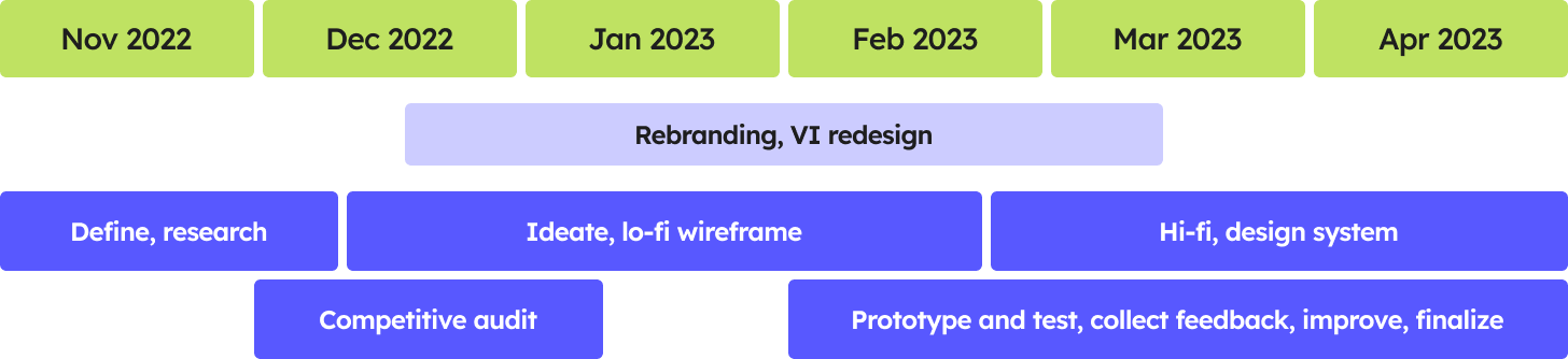
I led the end-to-end product design from research through hi-fi delivery: stakeholder interviews, remote interviews with agents in Indonesia and Vietnam, a competitive audit of seven regional players, and a scalable mobile design system that lets each country flex while staying visually unified.
Research
Listening before designing
Before any wireframe, I ran remote interviews with 10 agents in Indonesia and 15 in Vietnam with local researchers. We added a competitive audit of seven regional platforms, mapping flows, feature sets, and UX patterns.
Four insights anchored everything that followed: trust is an asset, quality of service is the moat, agents specialise narrowly, and complex products demand heavy training that the previous app was not delivering.

Cross-cultural design decisions
Trust as the design substrate
Across both ID and VN interviews, agents repeated one word: trust. We treated it as a design material — slower motion, clearer disclosure, photographic content from real local agents, and a typographic system that privileged readability over flourish.
Specialism, not breadth
Most agents specialise in only 2–3 product types. The previous homepage showed everything to everyone. The new homepage prioritises the products relevant to each agent’s specialism, reducing the effort needed to find what they sell most often.
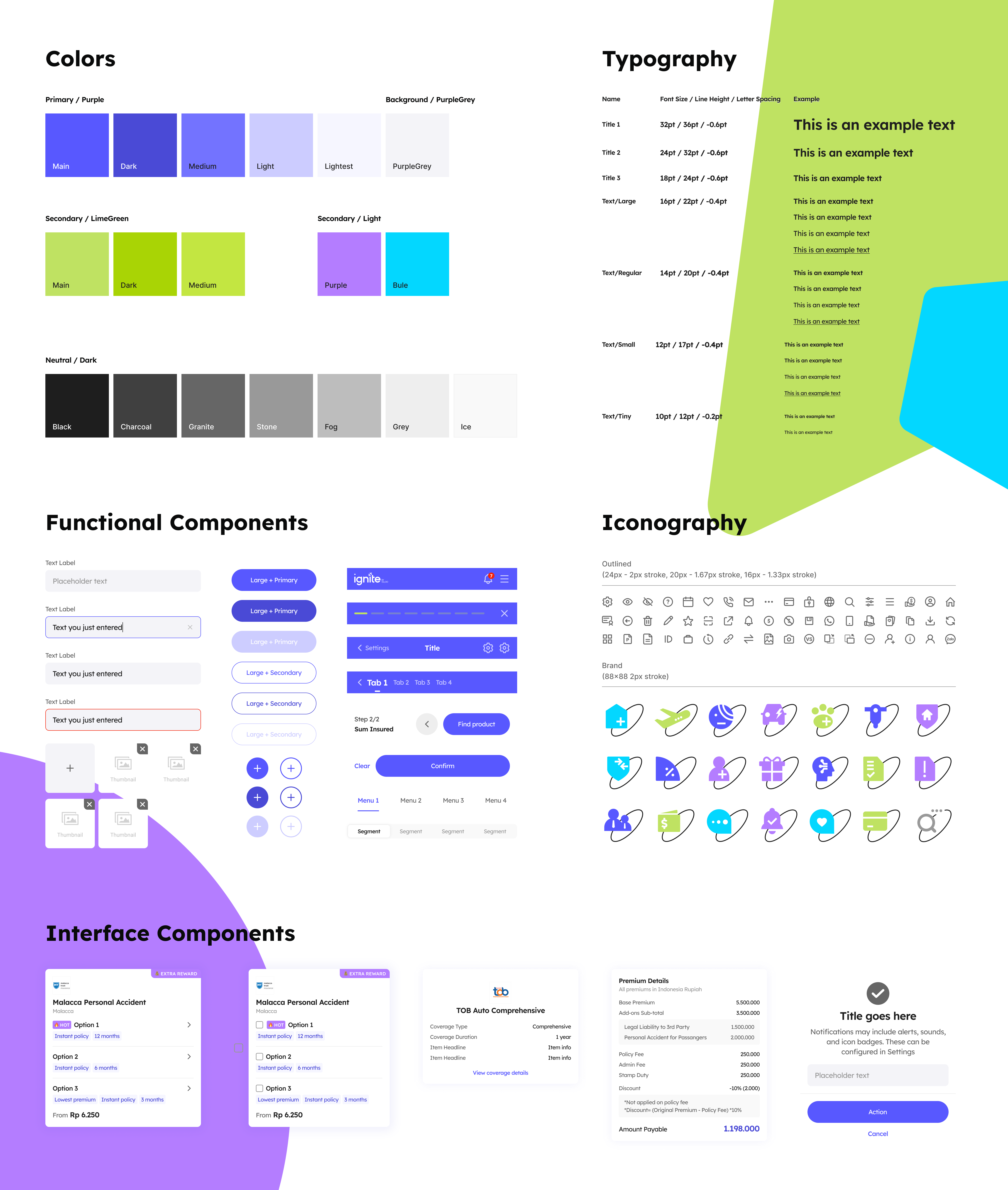
One system, four flavours
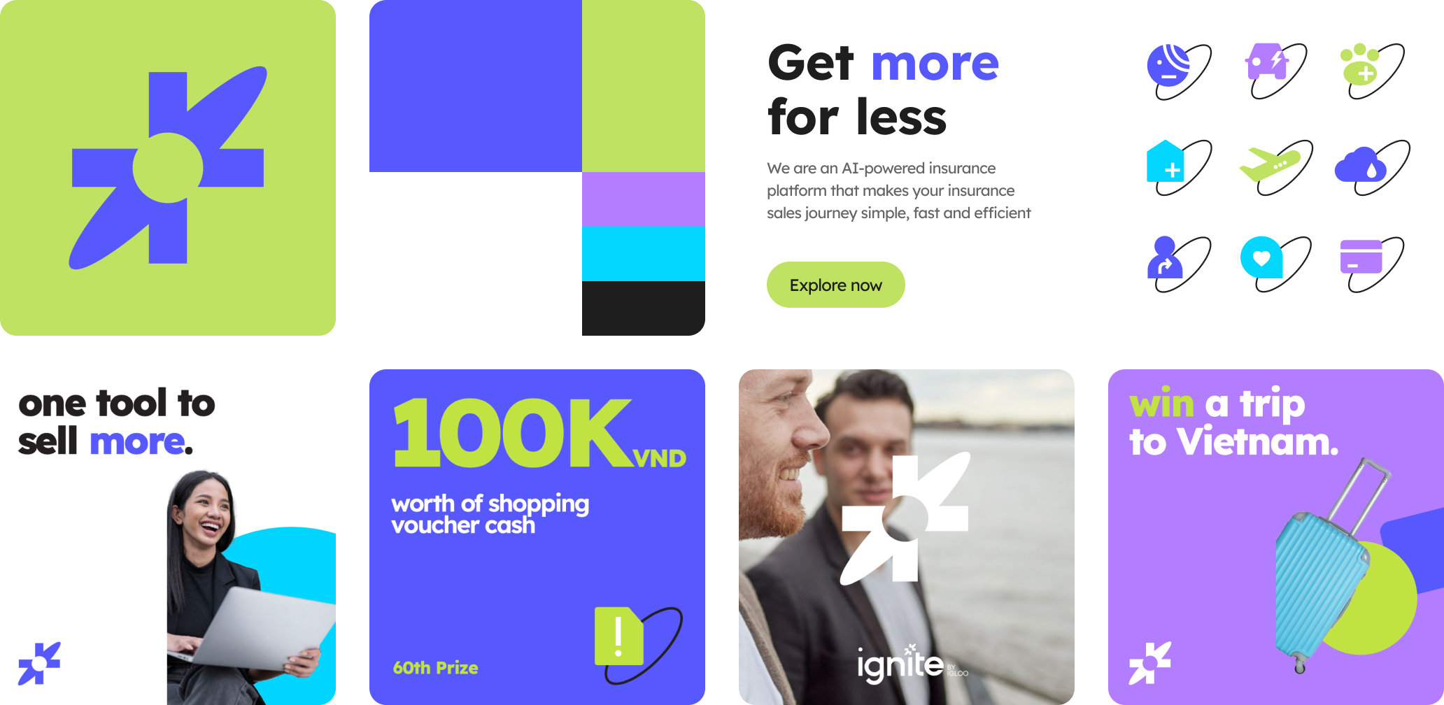
I built a Figma library where the same components can host market-specific product classification, language length variation, and regulatory disclaimers — so the 4 countries ship from the same source of truth without one country dictating the other's experience.
Relationship-driven business culture
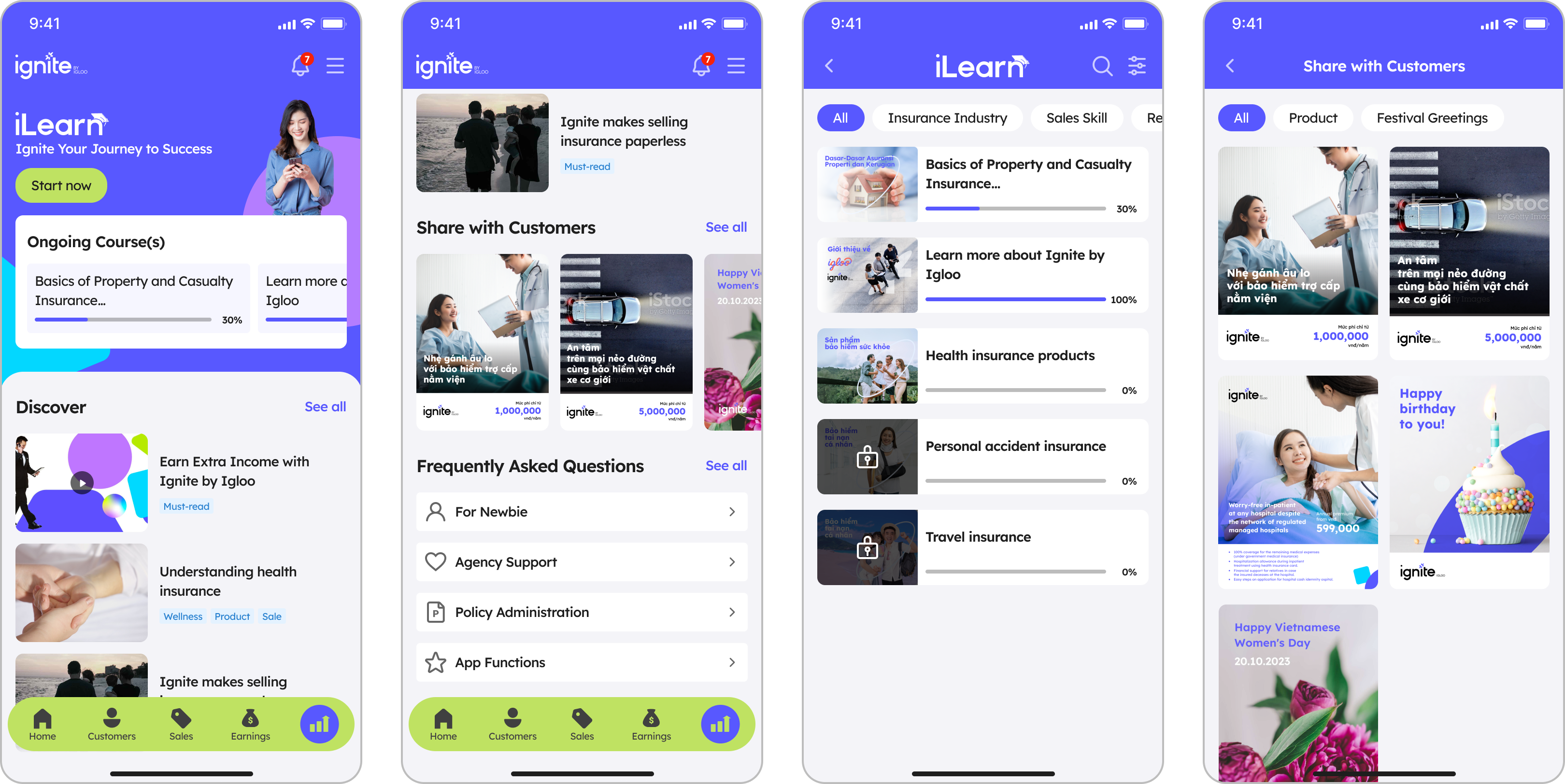
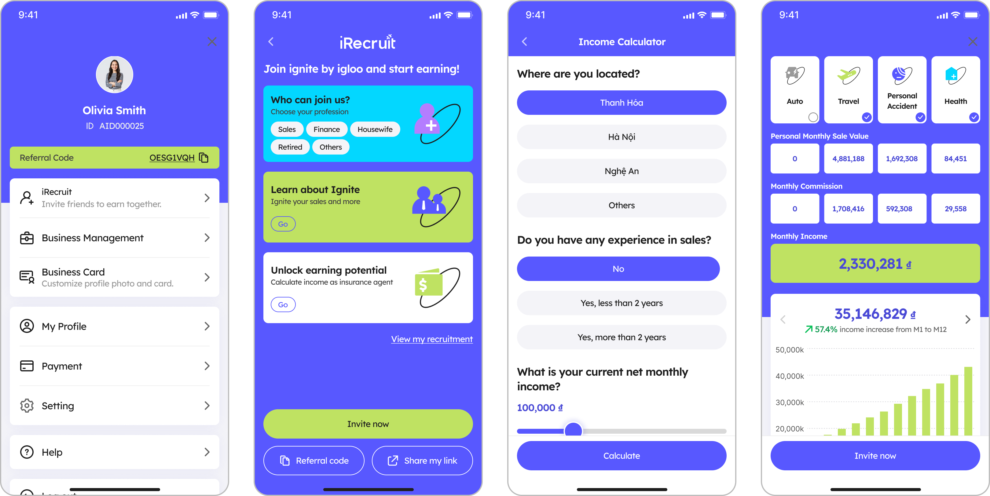
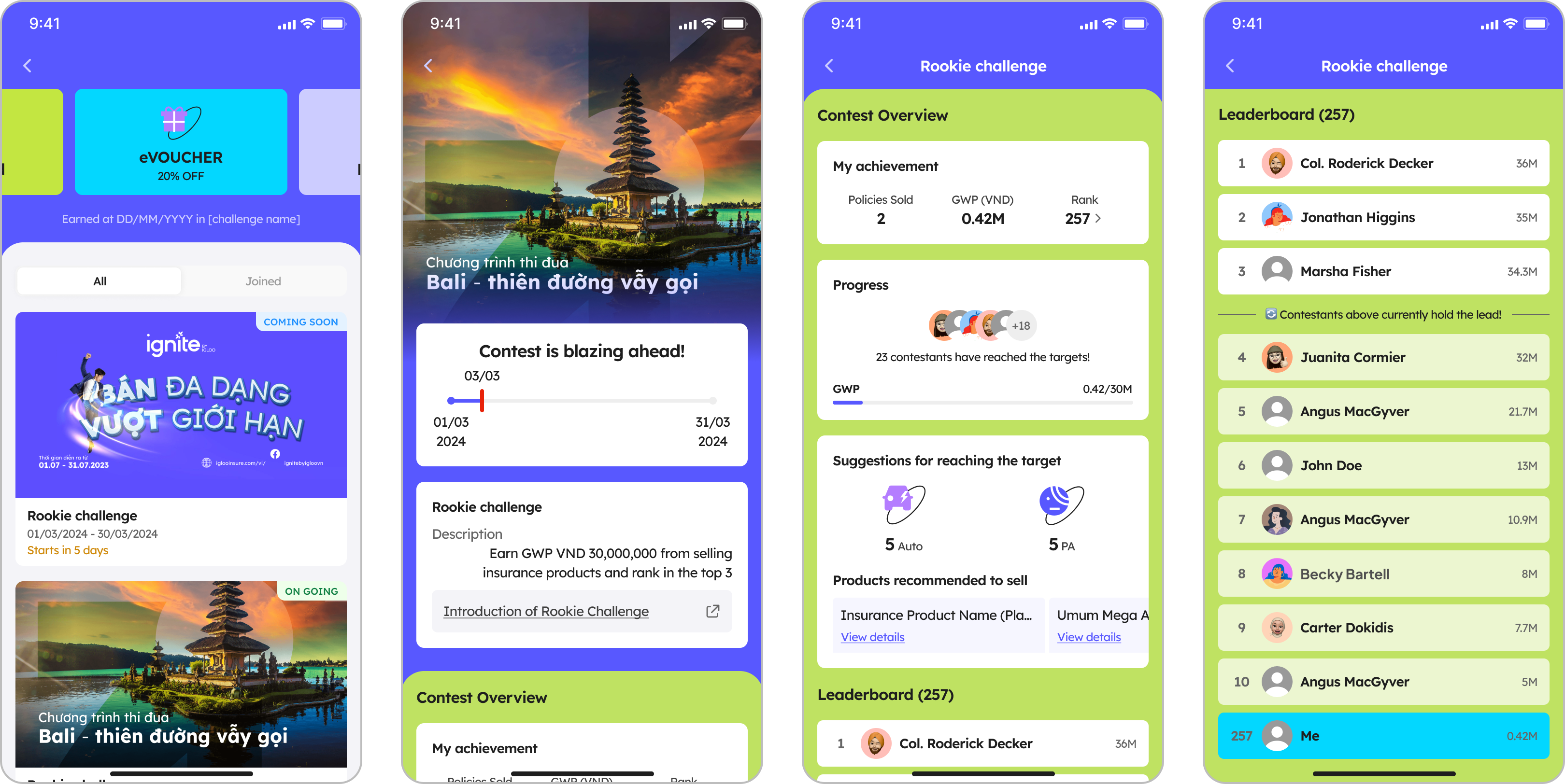
SEA agent networks are deeply social. New Recruitment and Contest modules turned what used to be private sales tools into shareable, community-shaped surfaces — designed for WhatsApp-first sharing patterns rather than email-first ones.
Strategy
From scattered tools to a single agent surface
The interviews showed that agents did not experience their work as a catalogue of insurance products. They moved through a day of prospecting, matching, selling, managing customers, and growing their teams. I therefore reframed the brief from "redesign the app" to "design the agent’s working day."
That decision shifted the information architecture from product-led to journey-led. It meant giving up a single catalogue-first homepage, but it let each surface optimise for its real task: speed in prospecting, confidence in selling, and control in customer management.
Craft
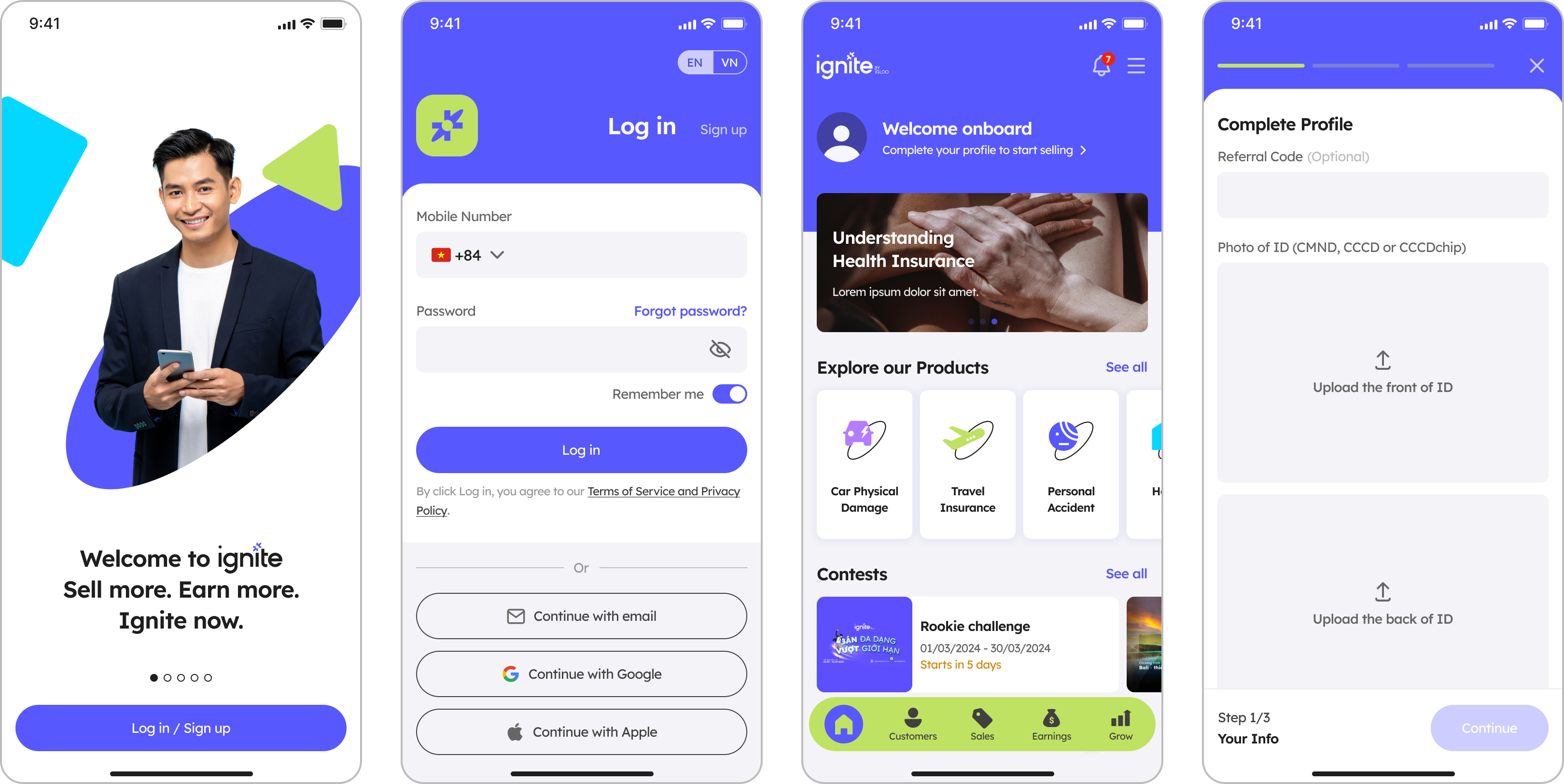
Onboarding, homepage, purchase, customer management
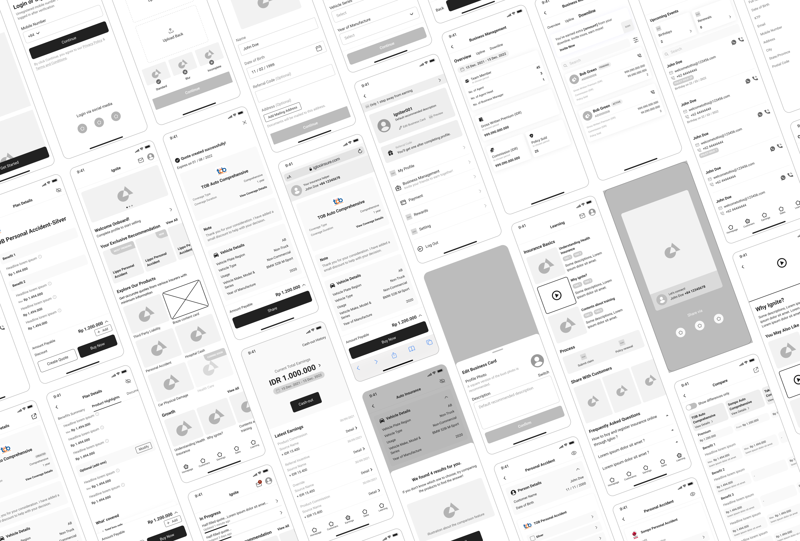
The before-and-after screens below show where the strategy changed the product: a shorter mobile-native onboarding sequence, a homepage prioritising each agent’s specialism, a clearer purchase structure, and customer profiles with actions in context.
All four flows shipped against one regional design system. Market-level variants handle language, product classification, and regulatory content without turning each country into a separate product.
Onboarding
Before — long sign-up form
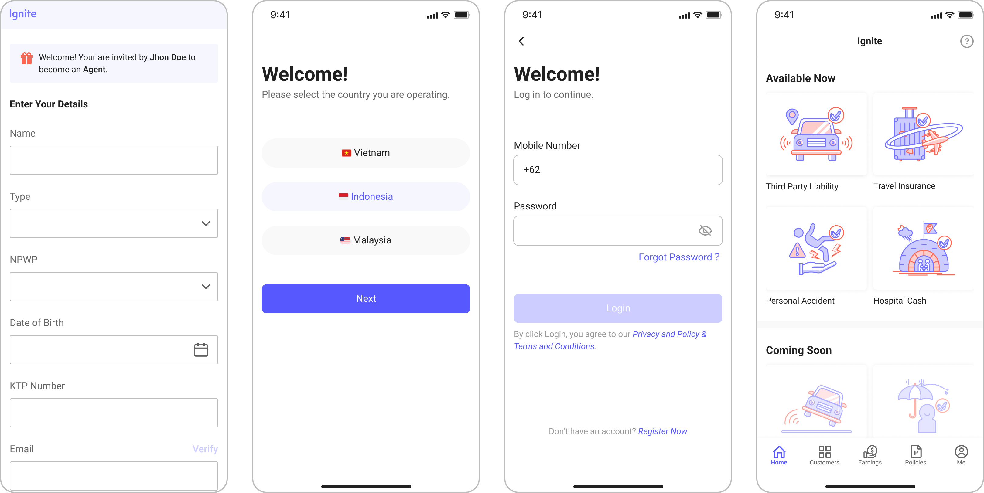
After — streamlined onboarding
Homepage
Before — displays insurance products only
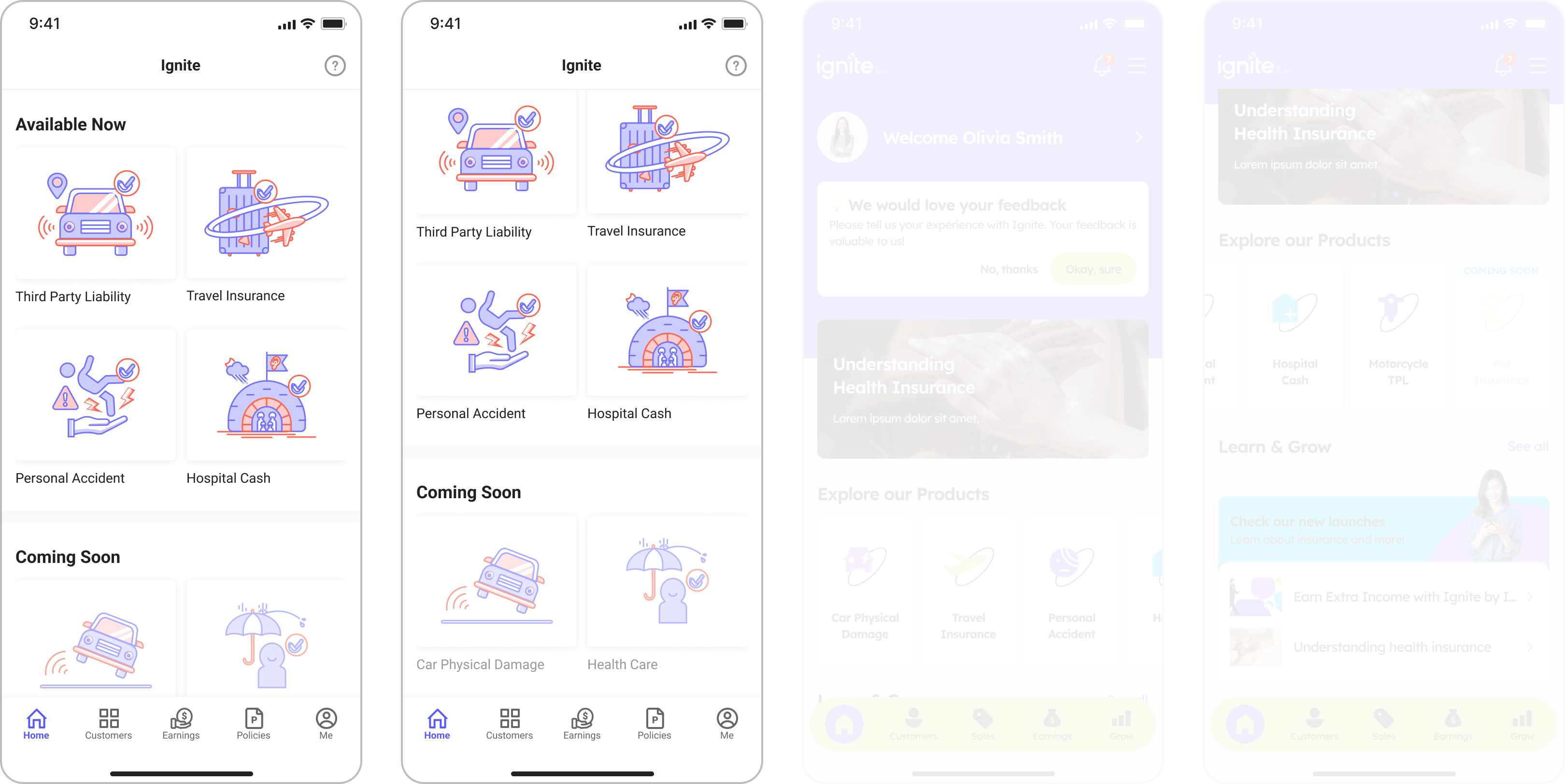
After — informative and intuitive

Purchase flow
Before — repeated information, confusing navigation
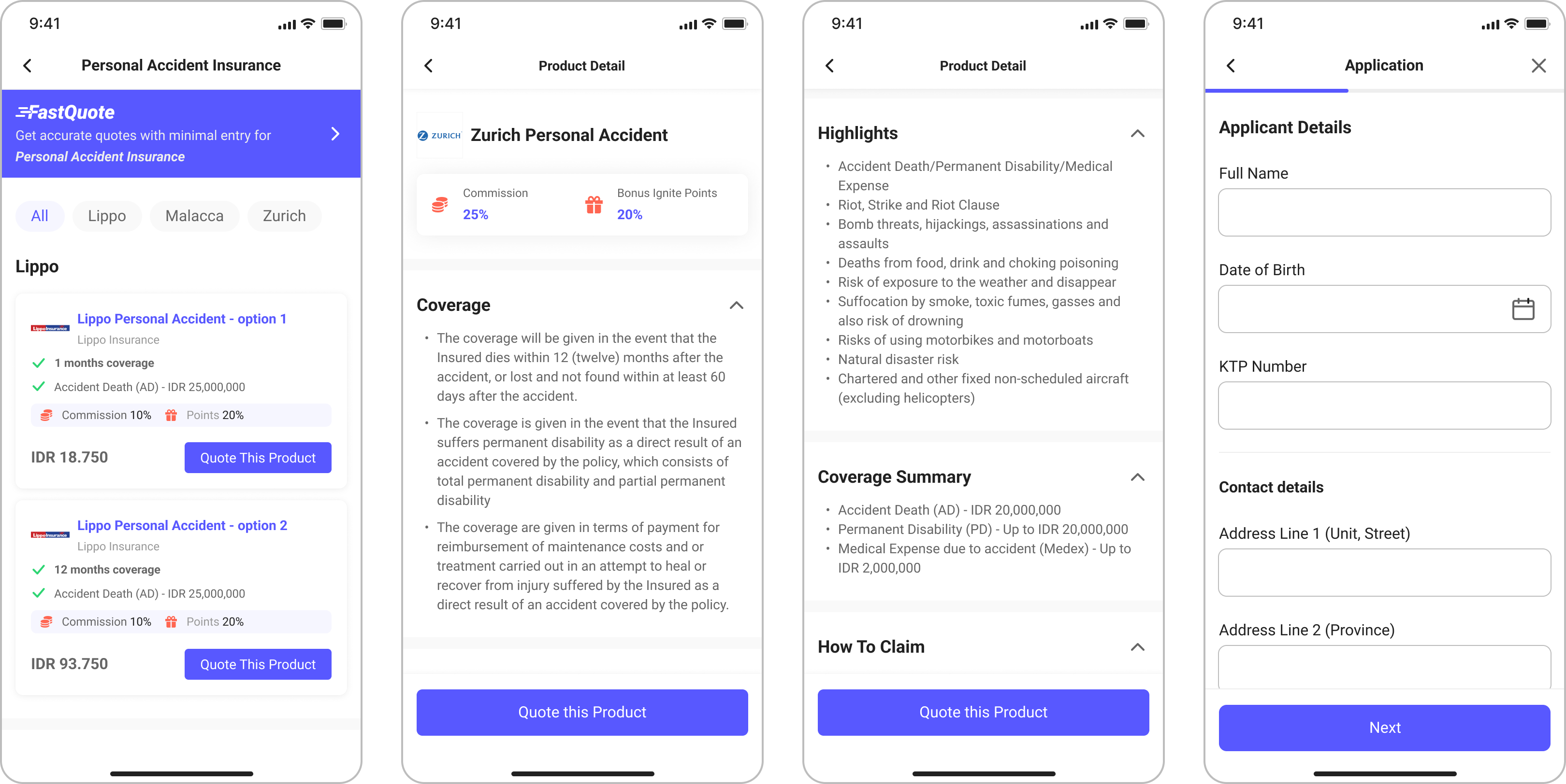
After — clearer information architecture
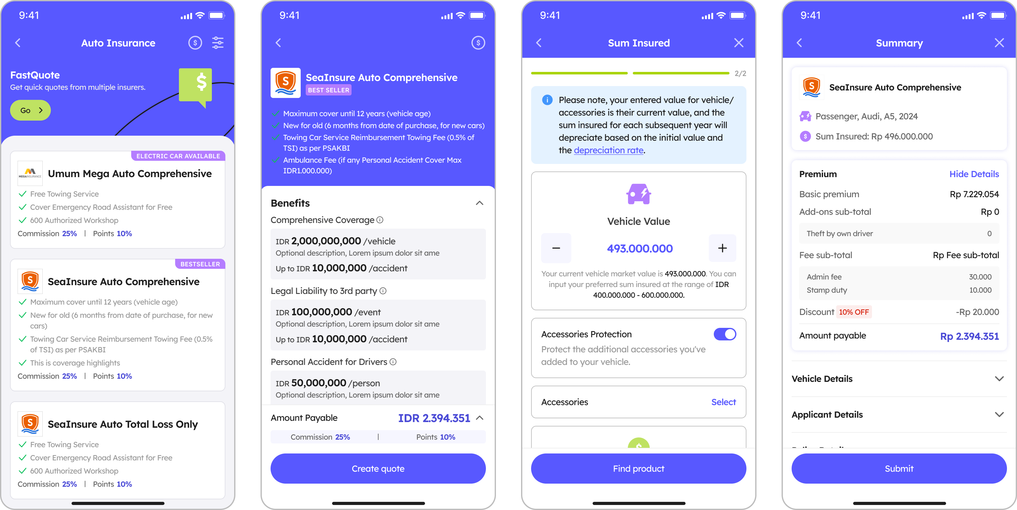
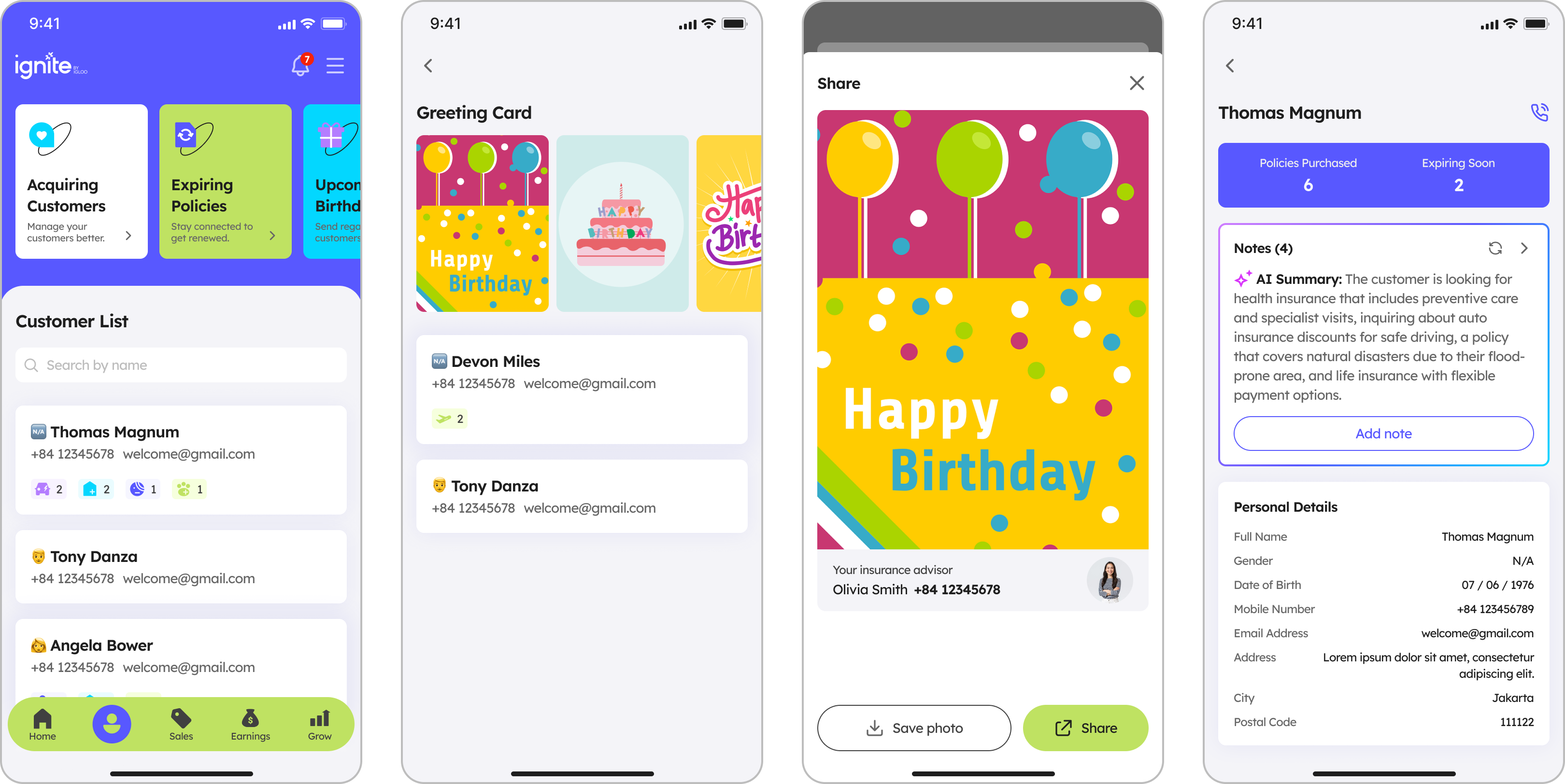
Customer management
Before — plain list of basic contact info
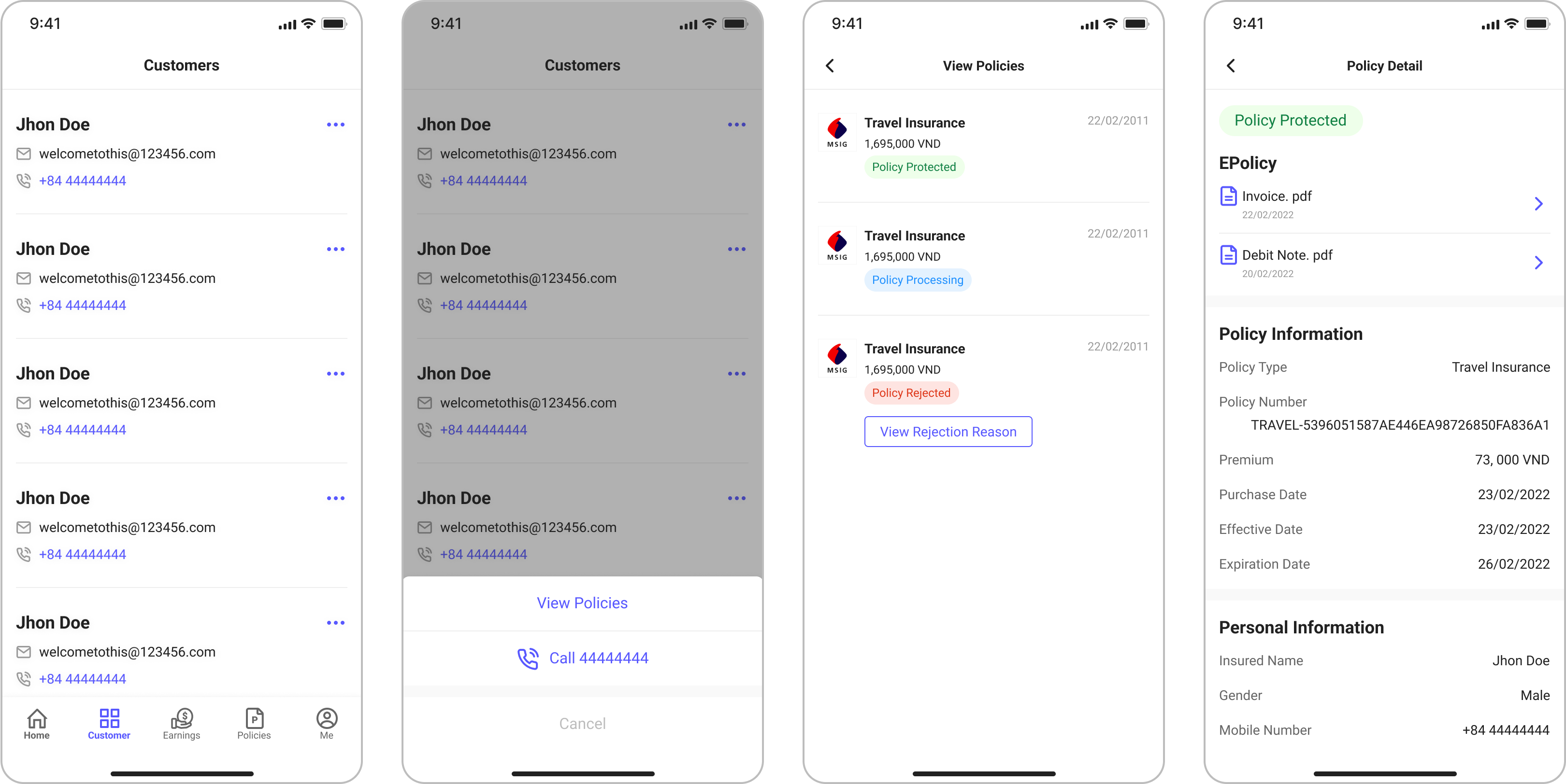
After — rich customer data for smarter management
Iteration
Designing the feedback loop
- 60 days
- Post-launch survey window
- 300+
- In-app survey responses
- 73.5%
- Reported satisfaction
- 67
- NPS score
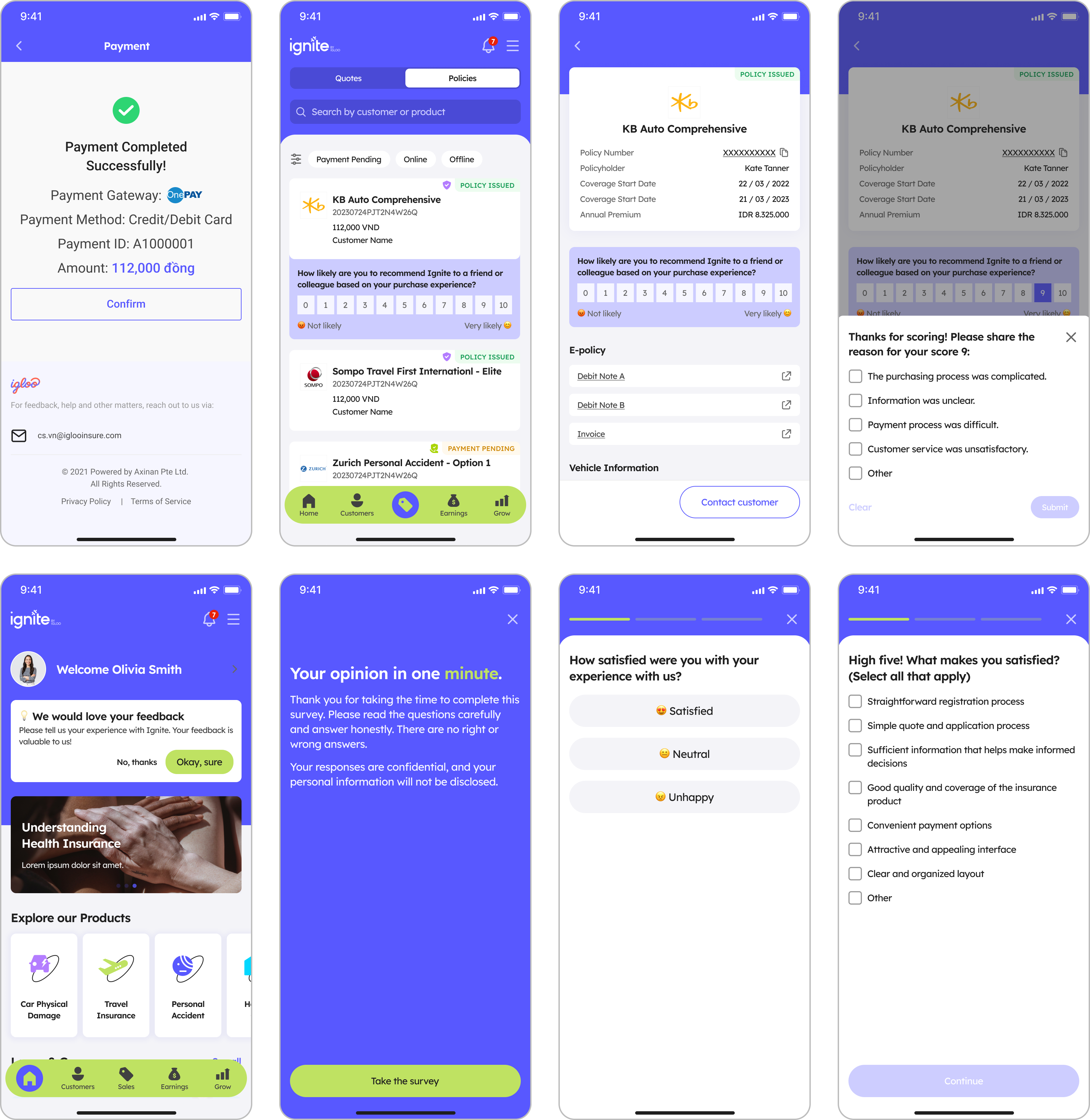
I built an in-app survey system that triggers after meaningful events — a completed sale, a finished training — paired with usage data tracking. This means every release lands with a measurable signal, not just a screenshot.
Three new modules — Grow, Recruitment, and Contest — were prioritised directly from this feedback loop, each tying back to a documented agent behaviour.
Measurement loop
- Release
- Usage analysis
- In-app research
- Prioritization
- Continuous improvement
After launch, I combined usage data analysis with in-app research to continuously observe where agents encountered friction in key flows, understand which new features were creating real value, and use those signals to prioritize future product modules.

Outcome
This redesign went beyond a visual refresh. It reframed Ignite as a regional product around the agent’s full working journey—from prospecting and selling to customer management, learning, and team growth—giving four markets a shared experience framework without erasing local needs. A scalable design system reduced fragmentation across market-specific releases, while behavioural data and in-app research created a repeatable way to validate problems, assess value, and set priorities. The result was not only a more complete product, but a shared operating language for deciding what the regional platform should do next.
Next case
03 · CMB Private Cloud
A unified internal cloud platform for one of China's largest retail banks